SPORTS NONPROFIT REBRAND
Localizing a nonprofit brand to reflect inclusion
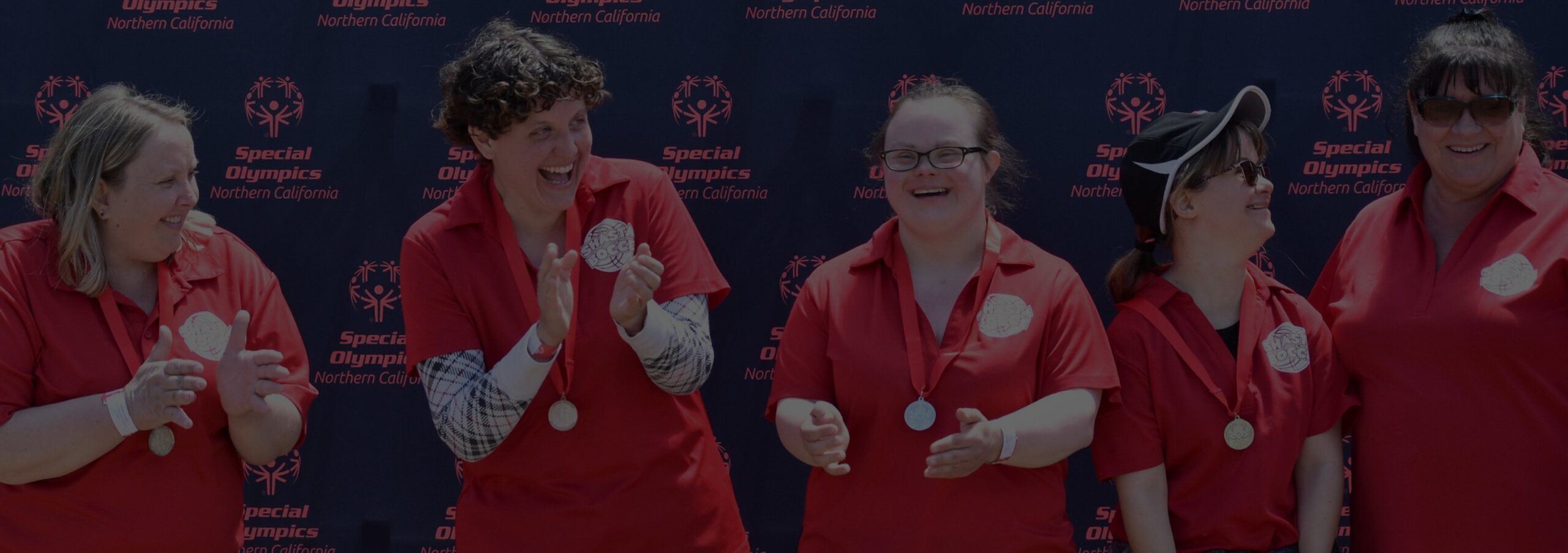
As the local chapter of a well-known nonprofit, Special Olympics Northern California is part of a bigger movement toward a more inclusive world. When they applied to our Design in Kind program, passion won them the bid. We were thrilled to help with a new brand that is as joyful and bright as their vision.
+ Brand Audit
+ Visual Identity System
+ Brand Guidelines
+ Asset Library
+ Brand Messaging
+ Tagline
+ Creative Direction
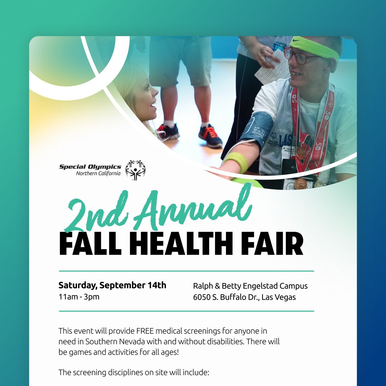
+ Marketing Templates
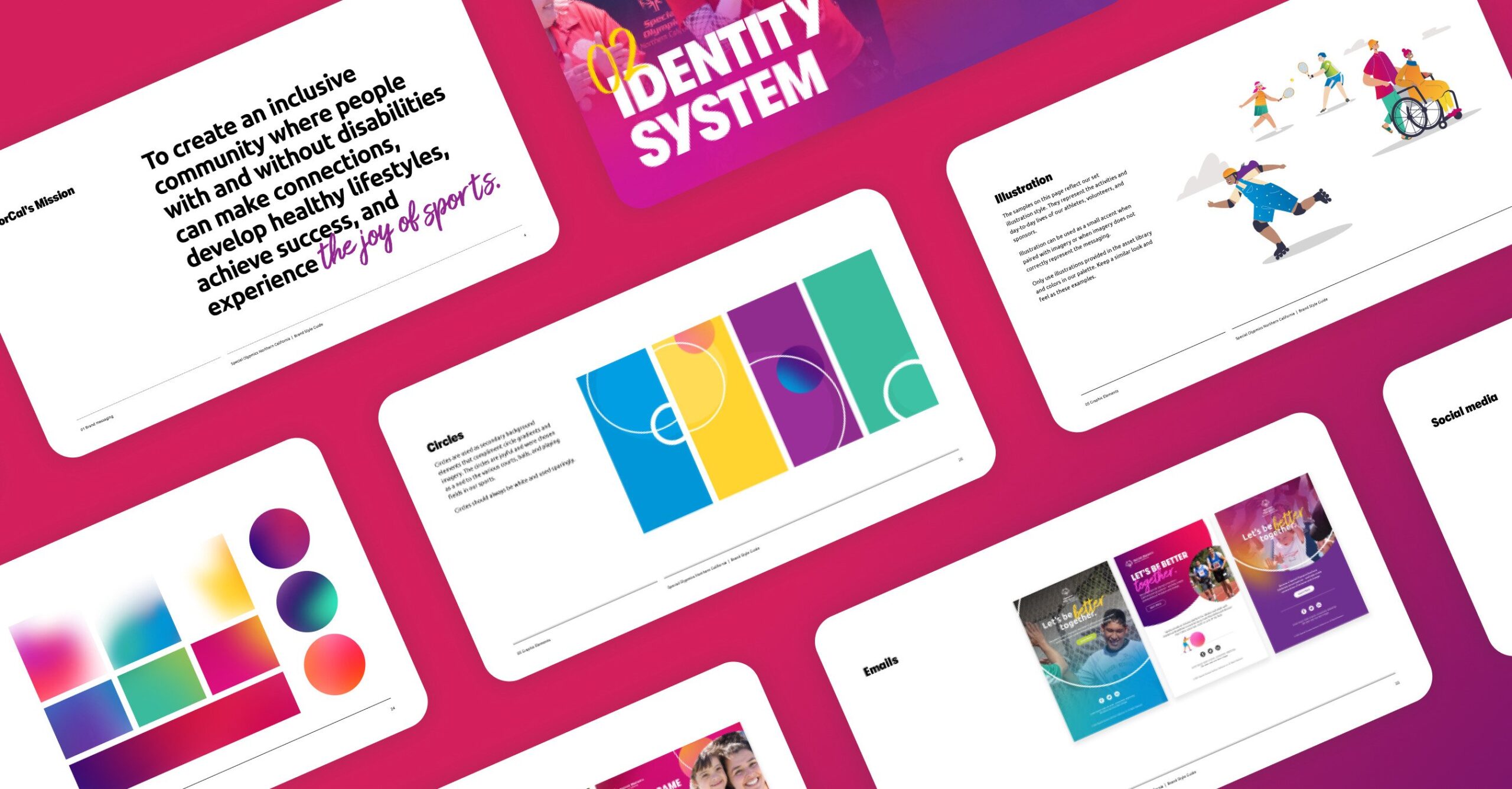
Exuding the vibrance and heart of this nonprofit was essential at every turn.
They needed a refresh with guidelines that would act as a source of truth for their staff, volunteers, and external partners. From the tagline to the visual identity, every aspect of the new brand now exudes inclusivity and joy.
Challenge
The brand needed to be distinct. While Special Olympics Northern California always echoed their parent organization, their voice and aesthetic lacked any local flavor. How could we help uphold Special Olympics standards, while creating an identity unique to the NorCal community?
The new brand would reflect both the joy of sports and the local chapter’s keen focus on unity and acceptance for all.
Approach
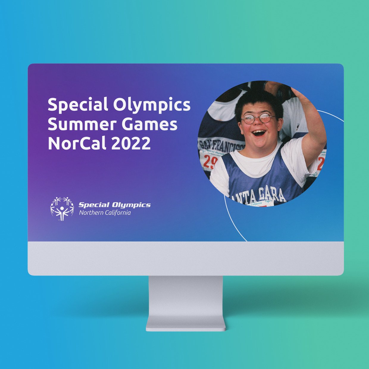
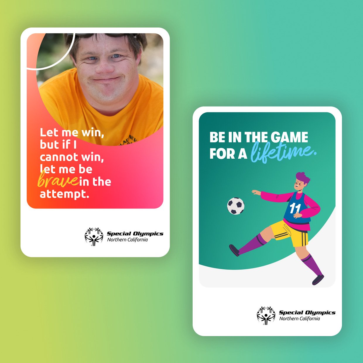
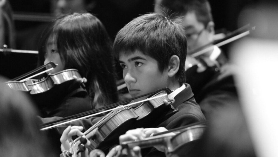
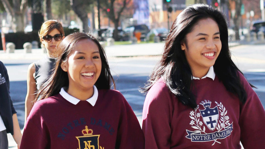
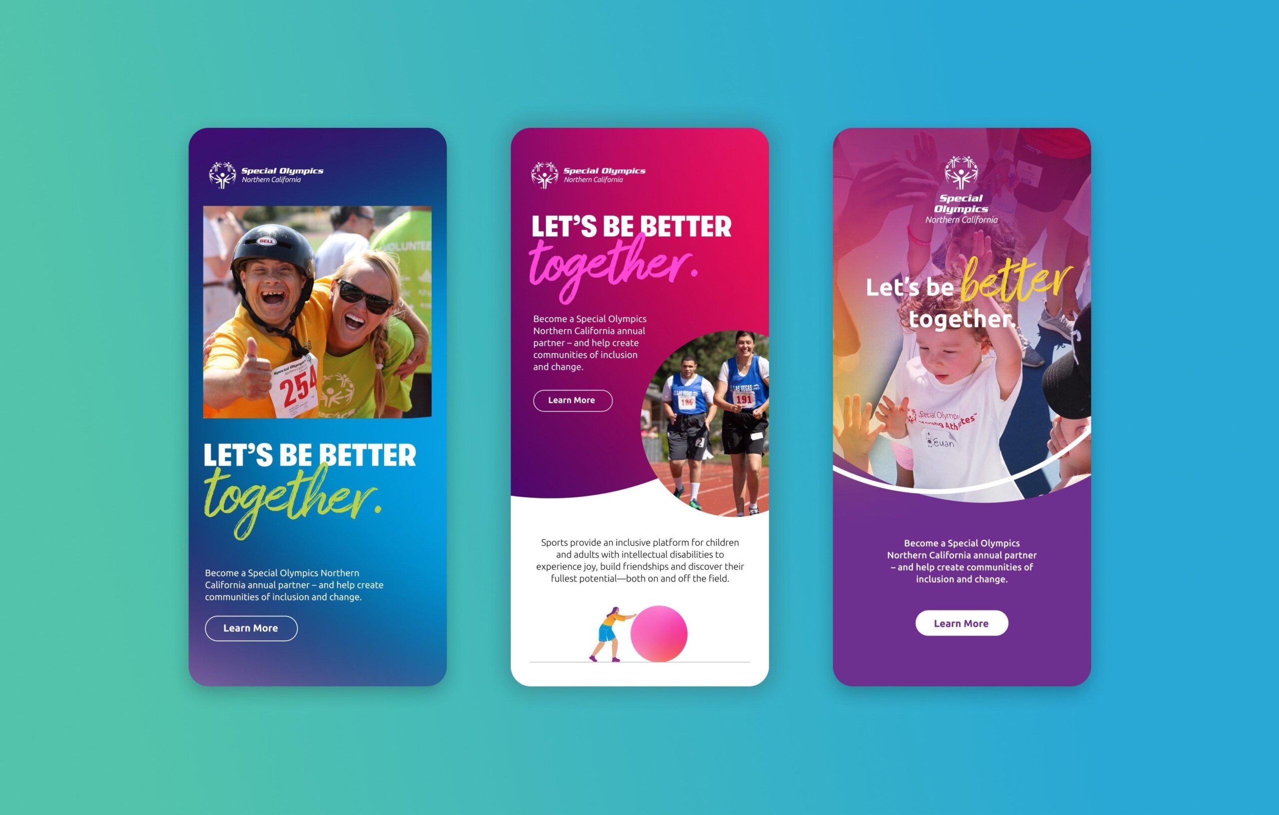
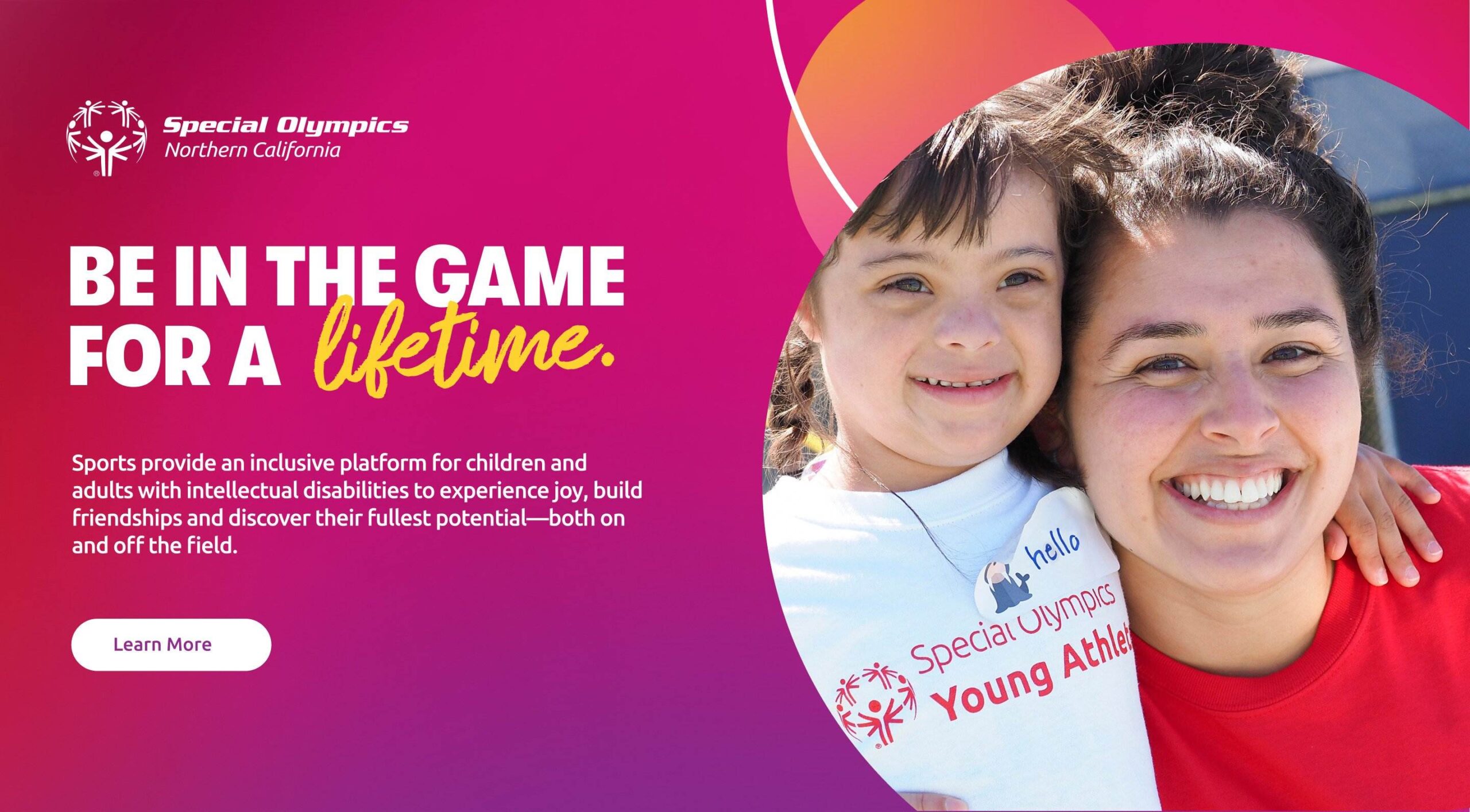
Our creative concepts were structured around key differentiators–joy, positivity, and connection. Everything we presented showed sports but focused more on moments of friendship and personal victory. We used bright colors, bold shapes, and expressive photography and language.
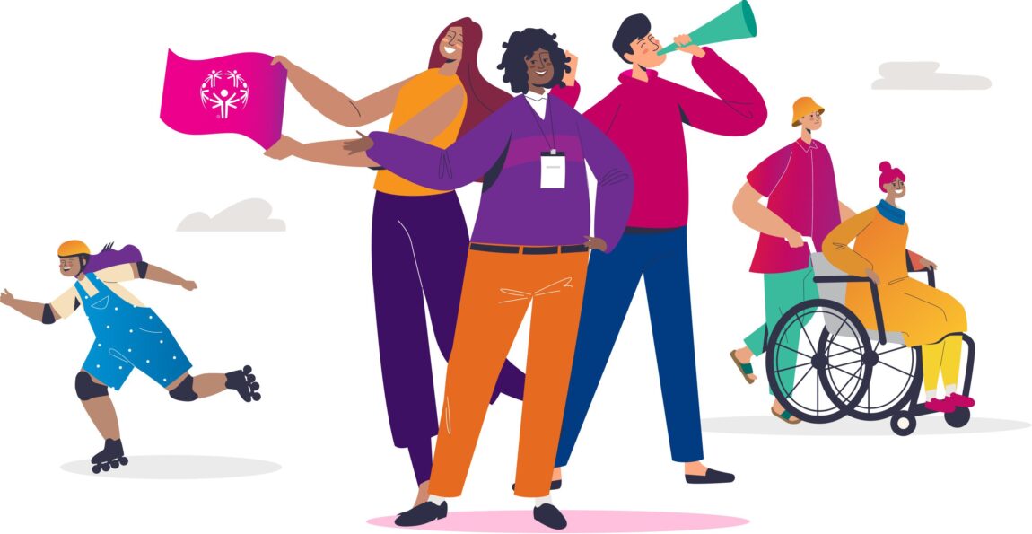
Both design and messaging are now more emotional and energetic. Some brand elements are familiar, but all have been enhanced to reflect the vibrance of Special Olympics Northern California. Notable are the new color combinations, playful illustrations, and script font; the vocabulary is more vivid, too. But smiles and the idea of inclusion shine brightest of all.
Results
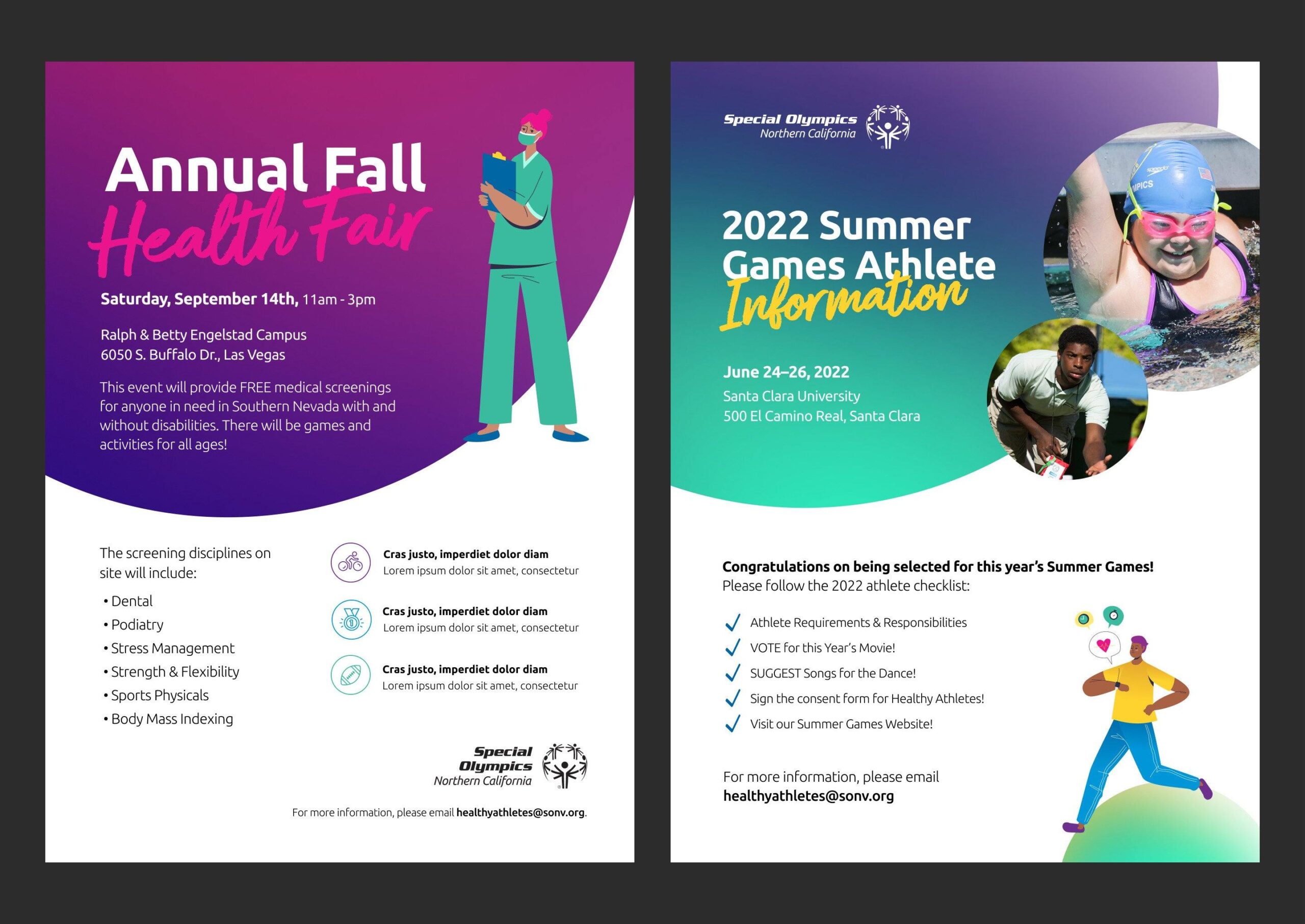
We developed a robust brand system that is infused with joy and positivity. It is original, distinct, and authentic to Special Olympics Northern California. All design and messaging elements are defined in a guideline, with an accompanying toolkit to help ensure consistency as the nonprofit continues to scale its brand.
The deeply collaborative nature of this project led to a trusted and ongoing creative partnership. We were immediately slotted for their next big initiative and look forward to working together for years to come.
Creative. Warm. Efficient. Collaborative. Intelligent. Polished. Women-led. Top-notch… These are just a few words to describe the outstanding Design in Mind squad. I highly recommend and I’d put my reputation on the line for them. They are a cream-of-the-crop agency. Period.
Special Olympics Northern California
Jess Daugherty
Head of Marketing
This project was granted a pro-bono budget.
Learn more about our annual gift.
