QUICKEN BRAND REFRESH
Cashing in a new look for a personal finance giant
As a leader in personal finance software for more than 30 years, Quicken’s customer base was large and well-established. But they needed a visual refresh to reinforce the relevancy of their products to an increasingly younger customer base and position them against newer technologies on the rise. They asked us to create a cohesive set of brand elements including typography, color palettes, imagery, and graphics to help their brand stay competitive.
Brand Development
Brand Strategy
Brand Identity
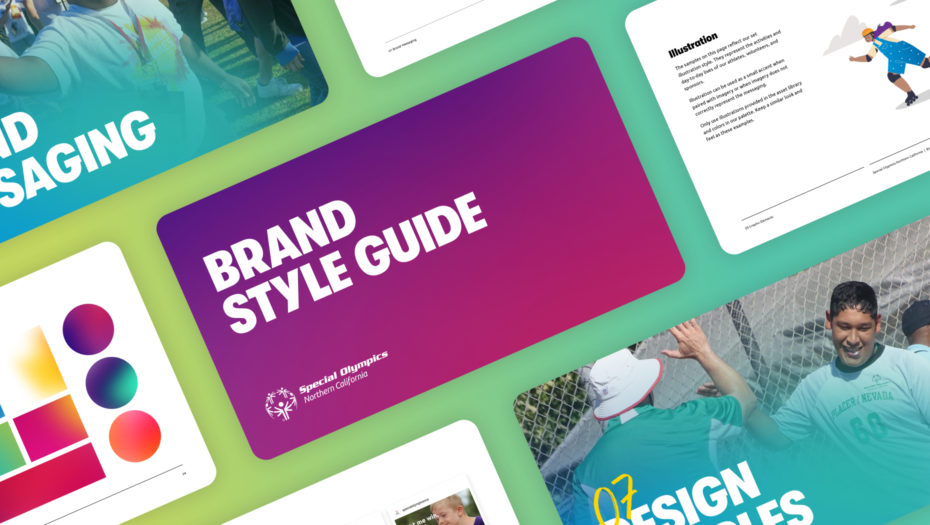
Brand Guidelines
Asset Libraries
Web Design

Any changes to the Quicken brand had to be bold enough to attract new customers, but subtle enough to keep the trust of their existing base.
Quicken was ready to tell the world that their software works for people approaching all kinds of life milestones. We helped them appear warm, fresh, and modern so that newer audiences would find them more approachable, but maintained familiar brand elements to keep their existing base engaged.

We write the rules.
Exploring Quicken’s new brand was only half the effort. The other half? Creating brand guidelines to set the Quicken team up for success. With a high level of specificity, we defined exactly how every design element should (and should not) be applied. We had to get the level of detail just right—too much and the guidelines are overly prescriptive, and too little and the brand risks lack of consistency. We carefully strategized the rules against their most common use-cases and provided the Quicken team with enough information to preserve the integrity of their brand across every execution, while still leaving room to explore.

Make it an easy rollout.
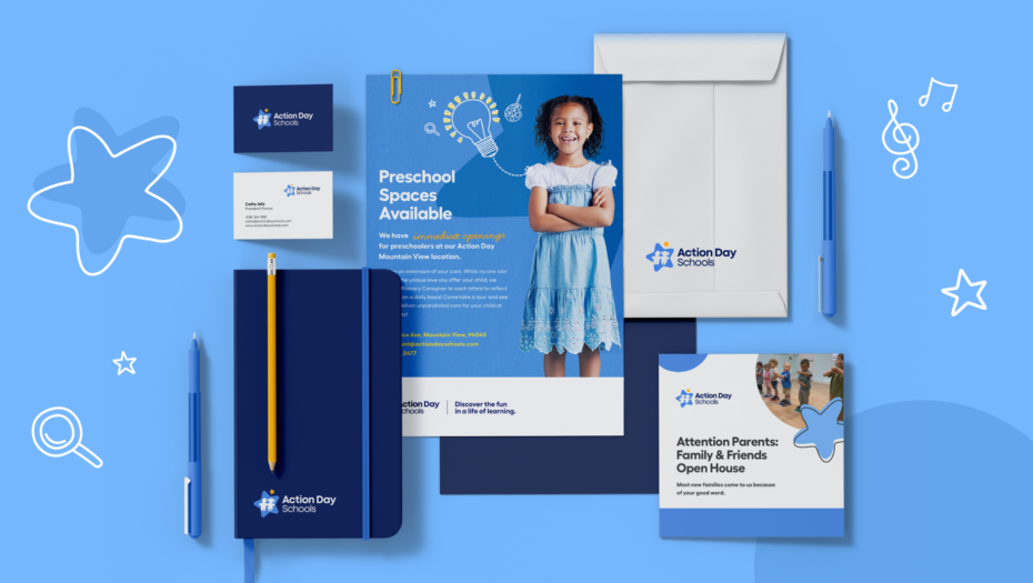
The most successful brand guidelines don’t simply outline the do’s and don’ts of a new brand, but acknowledge the company’s most imminent use-cases. In Quicken’s case, we included an entire chapter of nearly a dozen mockups to demonstrate how all design elements—fonts, colors, photos, and graphics—should come together. This was more than just a thoughtful touch; it was a powerful strategy to help Quicken unite its teams in a shared understanding of the new brand and expedite their work toward a public launch. Thanks to the variety of examples included, their marketing team had a head start and the practical references needed to quickly scale the brand.


I love working with Design in Mind because of their design-forward approach to branding or marketing challenges. You can be assured that you’ll be proud to showcase the end product. They work efficiently and effectively to keep projects on track and, most importantly are fun to collaborate with.
Build relationships, not just brands.
Once Quicken’s new brand was created and codified, they enlisted our help in rolling out their website, which is their most important tool for customer engagement. But first, we had to earn the trust of their internal web department. We applied their brand to a few key landing pages to start, and eventually onboarded as agency support for the rest of their site. We partnered with the Quicken team to roll out the website’s nearly 30 pages in phases, so that engagement was never interrupted.