BAY AREA NONPROFIT REBRAND
Rebranding a nonprofit to amplify its impact
Children Rising, formerly Faith Network of the East Bay, is an Oakland-based nonprofit that rallies support for under-resourced public schools. They help students faced by generations of poverty and educational inequity rise above substantial challenges and ignite their academic potential. After 18 years of service, Faith Network decided to change their name to “Children Rising” to better reflect their mission, promote their work, and garner support. This prompted an urgent need for a rebrand—a lengthy and expensive process—to which we donated our services and helped them create a visual identity that aligns with their goals for growth.
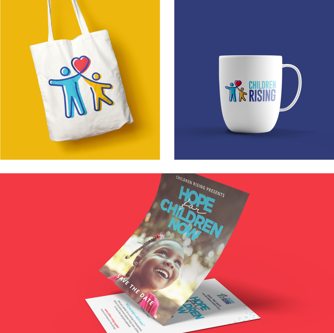
- Logo
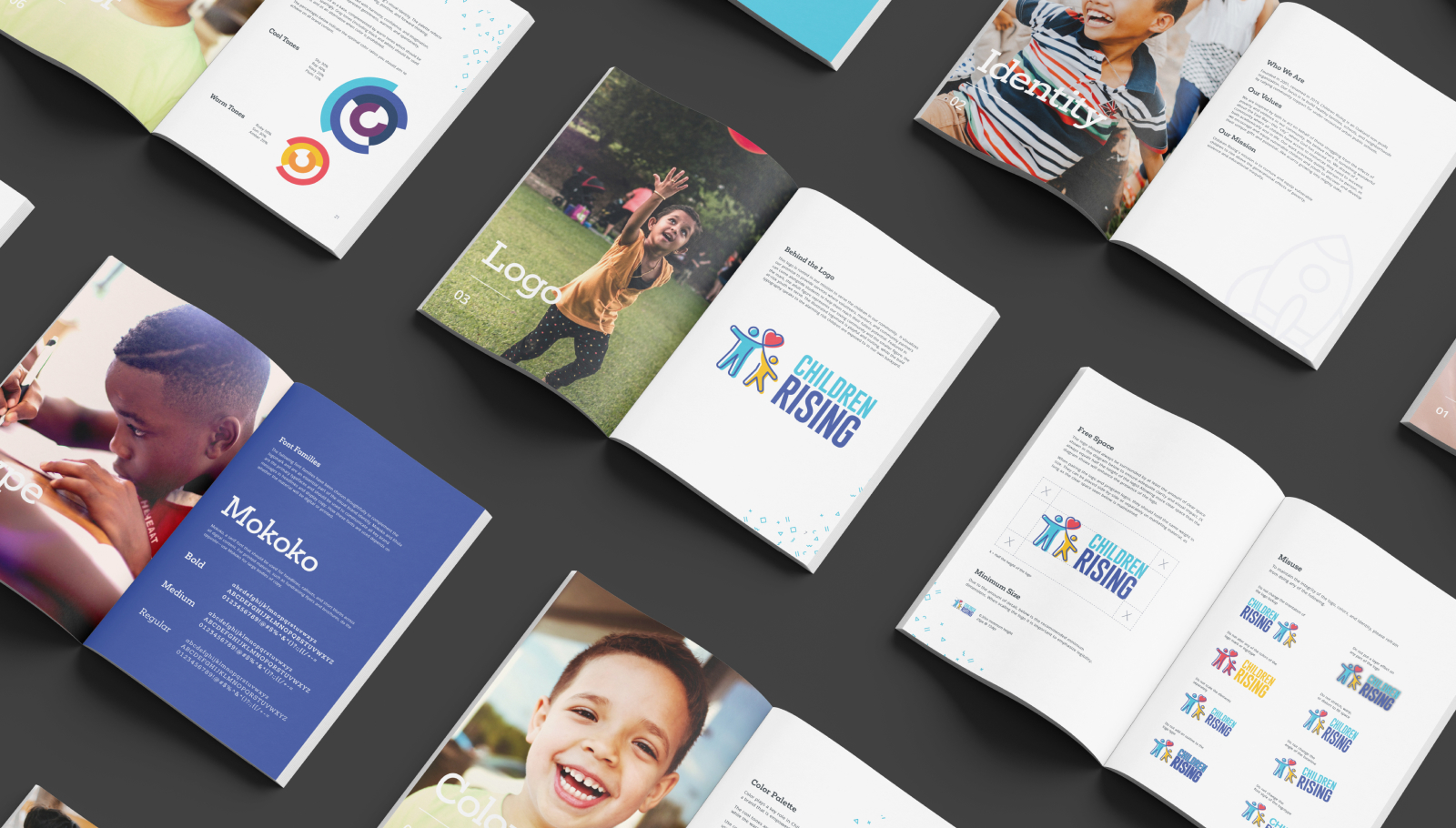
- Brand Guidelines
- Marketing Templates
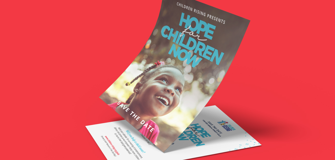
- Fundraising Campaign
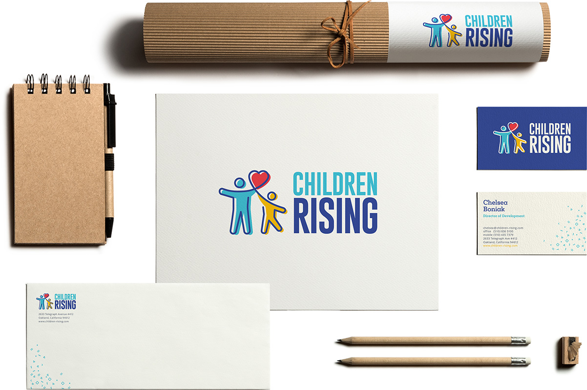
To reach a new generation of donors and volunteers, Children Rising needed a modern brand that would reflect their mission and resonate with the Oakland community.
Under the Design in Kind program, we gave Children Rising a complete visual update. The new brand builds upon the organization’s years of service as Faith Network and maintains its integrity while also offering a newed sense of vitality to their image.


Build on what already works.
Children Rising wanted to maintain its strong reputation in the community but modernize its image to appeal to a new generation of volunteers, students, and schools. To ensure their new brand would amplify the impact of the last, we leveraged familiar styles that would resonate with their existing audience and partners; we used a color palette and illustration style that were similar to the original brand. But with other design elements, we were assertive in creating something new and bold—it was about achieving balance. Each and every one of our strategic brand recommendations required a thoughtful approach and drew from a deep understanding of Children Rising’s unique challenges and goals.
We fill in the gaps.
Though Children Rising is well-staffed to sustain day-to-day marketing efforts, they need extra support on larger marketing initiatives, like this rebrand. We adapted our approach to meet their most urgent needs, rather than duplicate efforts; we served as a true extension of their team. Since their rebrand, we’ve collaborated with them to preserve the integrity of their brand during crucial periods of growth and outreach, and provided them with the design support, tools, assets, and guidance needed to scale. Through our ongoing partnership, Children Rising has seen the benefits of long-term agency support in helping their organization reach their goals, and we’re honored to serve as a partner in their mission.

Thank you! Your team is amazing. You created something very special for us and did so in an extremely short period of time. We’re excited to roll out our new brand and believe it will be instrumental in engaging the larger community and ultimately, serving more and more children in the coming years.
Count their wins.
In the year since we worked on their rebrand, Children Rising has helped more East Bay families with essential education, job-training, and nutrition services and shared the following milestones: